This article is intended not for those who work on the web, but for those who are hiring someone to build a responsive website for them. This article will help explain to business owners *how* there responsive website will work and answer some of the common questions we get on a regular basis on the nature of responsive websites.
Congratulations! Not only were you smart enough to invest in a new website, you were smart enough to hire someone who can build you a responsive web design!
There are a myriad of reasons to make sure your website is responsive, but since you are already convinced, I won’t bother re listing all of the benefits here.
When it is time for you to review the build of your new site, it can be a little overwhelming to know what’s normal and what is something that needs to be addressed. But how are you supposed to know?
The most important thing to keep in mind when reviewing your new site is that it could be viewed on *any* screen size. From the colossally huge () to the incredibly small (), visitors to your new site could be anywhere in between. So don’t just review your new site on your desktop at work. Look at it on your phone, laptop, or tablet to get an idea of how your website works in these different scenarios.
Designing a responsive website means that we as web designers need to plan for literally thousands of different screen sizes. This can sometimes lead to things like headlines, paragraph text, or background images not looking pixel perfect like in your mockups. But that’s ok. Responsive design isn’t about having your website look identical to each and every visitor. It’s about making sure your website *works* for each and every visitor.
Here are some common examples of things to expect when reviewing your new responsive website.
Stacking Content
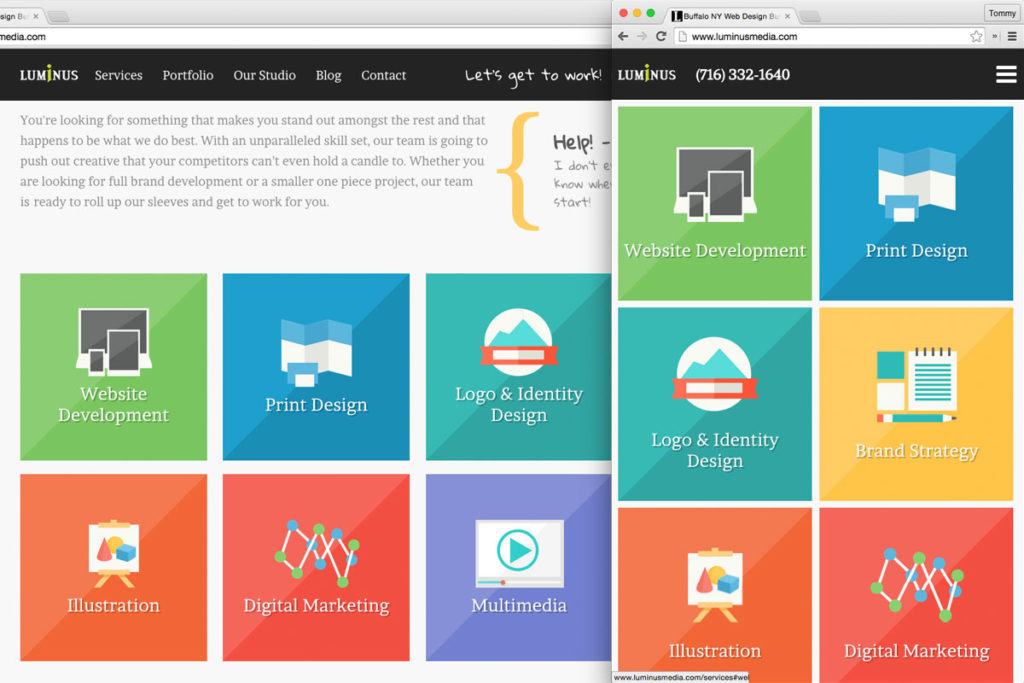 As the browser window gets smaller, your website will “squish.” When the width of the screen your site is being viewed on gets smaller, things like columns, images, and other page elements need to start stacking on one another to make sure your site stays legible.
Collapsed Navigation

Larger navigation menus don’t work so well on small screens, so one option may be hiding them in a collapsed “mobile menu.” Sometimes hidden behind what designers refer to as the “hamburger icon” (☰), this frees up screen real-estate on small screens and keeps the navigation items out of sight so your website visitors can more easily view the content they came to your site for.
Browser Compatibility
Not every browser acts the same. They all take you to the same websites on the same internet, but they way they display websites can vary. It’s the web designer’s job to make sure that your website *works* in all recent browsers (for us at Luminus, that’s Chrome, Safari, Firefox, and IE9+.) Making your website work in each browser can sometimes mean it won’t look identical between them, and that’s ok. Certain browsers aren’t capable of doing all of the same things, so having fallback plans that ensure your site still functions properly is the main goal.
Headlines Being on Multiple Lines (Hanging Words)

Sometimes headlines of blog posts or pages are just long enough that a word hangs off on it’s own line. On a print piece, that wouldn’t be acceptable. But on a responsive website this is normal. What may appear to be an extra line for you, may be one line at another size or two evenly spaced lines at yet another.
“White Space”
White space is an extremely import element of all design work, not just on the web. Sometimes your website may appear to have a lot of “empty space” in the margins. This is another instance of what you are seeing, may not be what others are seeing. That margin makes sure your content stays structured and clean, and will vary depending on the device/screen size of the visitor.
Image Cropping
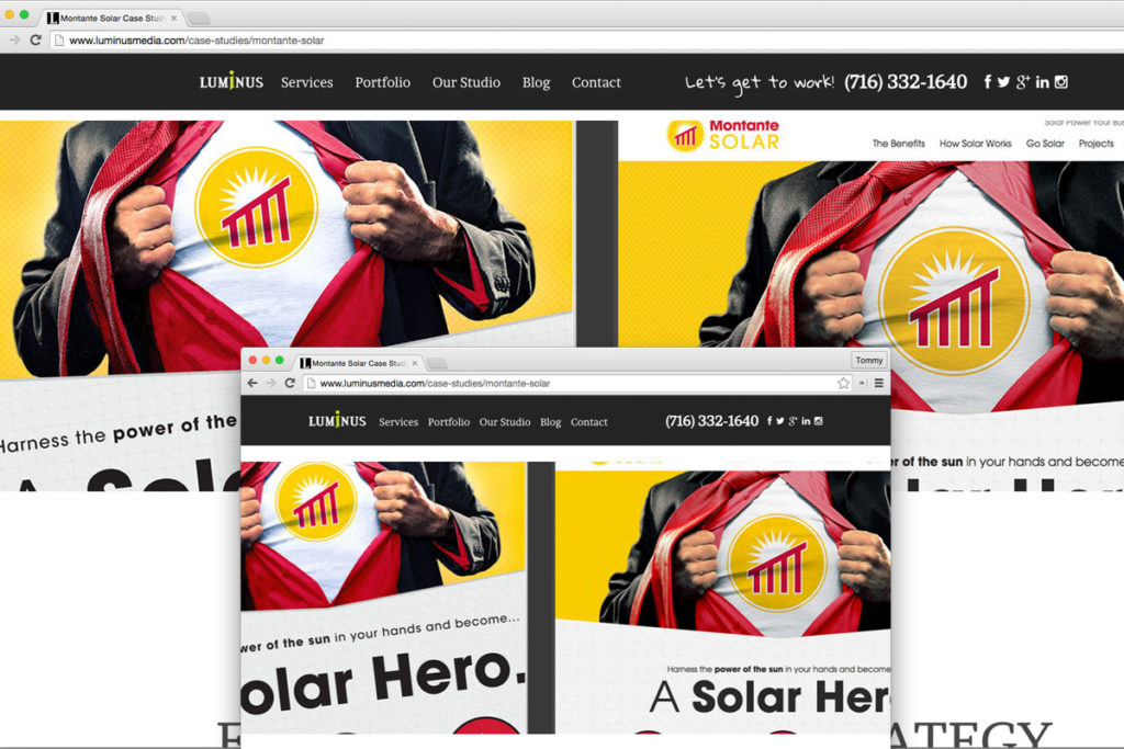
Background images often get cropped based on the container they are being used as a background for. The important thing to remember with background images is, just as their name implies, they are meant to be in the background. They add character to a site, but the content in front of them is the star and is most deserving of your focus.
Hopefully these FAQs will help give you some clarity into what to expect when you receive your new responsive web design from your designer. Never hesitate to ask questions to your developer, but keep in mind that sometimes a website needs to act a certain way in order to work as efficiently as possible to as many of your potential visitors as possible.
**The most important thing you can do** as a client is not to worry about things like button color, image sizes, or font choice. (That what you hired your designer to worry about!) Put as much of your focus as possible on your content. In the end, **your content and the strategy to implement it is what will get your sales** and that is far more important than what shade of blue that button on the about page is.