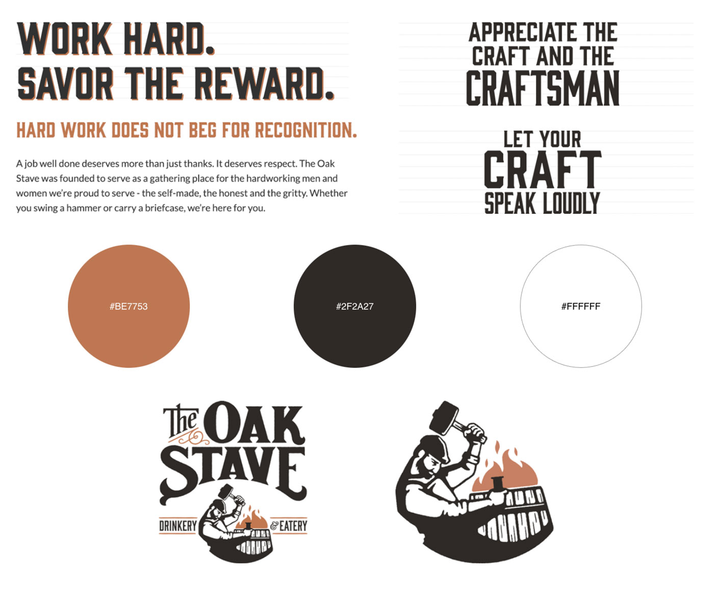
Work hard, savor the reward
The founders of The Oak Stave saw opportunity in bringing the experience of a hip, upscale city-style restaurant to the suburbs. Our team helped them build a successful brand from scratch that would resonate with their customers and stand the test of time. They needed a brand built from the ground up, including a name. Working together with the owners, we were able to create a brand that works hard and delivers on its promise.

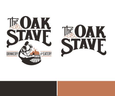
Working with the client to get the perfect name, we went through a detailed analysis of many options. We had a spirited discussion and slowly eliminated names that didn’t pass the test. Collectively, we felt The Oak Stave represented our best chance of building a strong and lasting brand that customers would identify with.
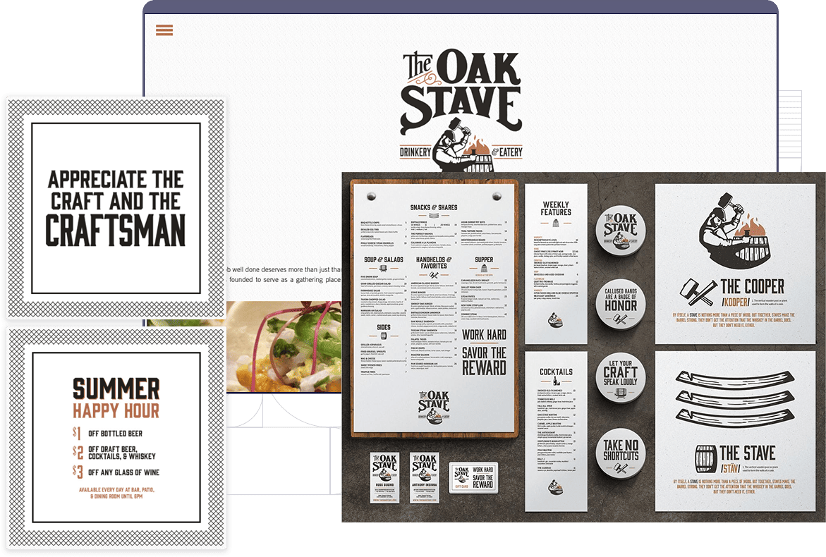
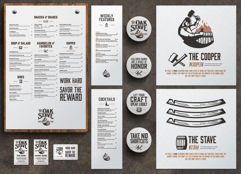
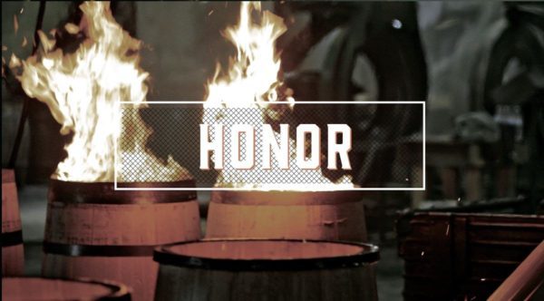
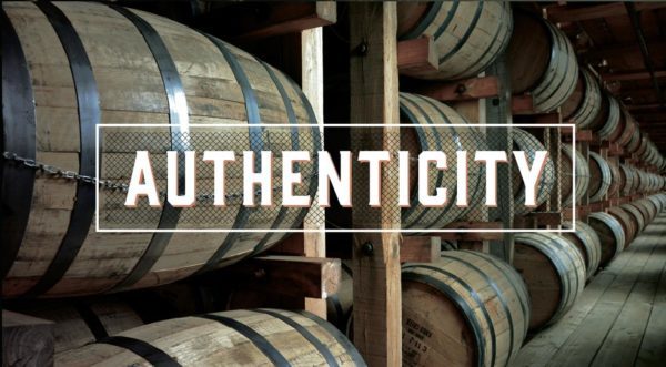
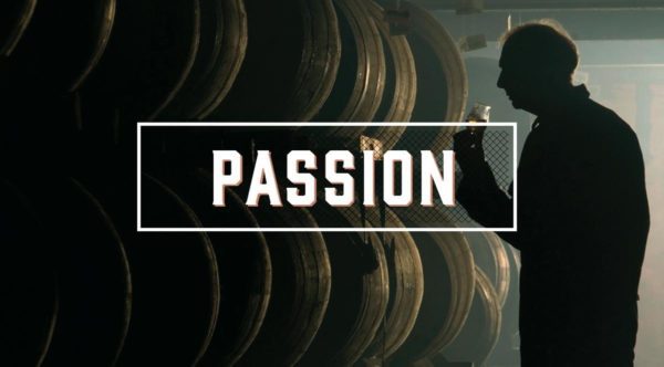
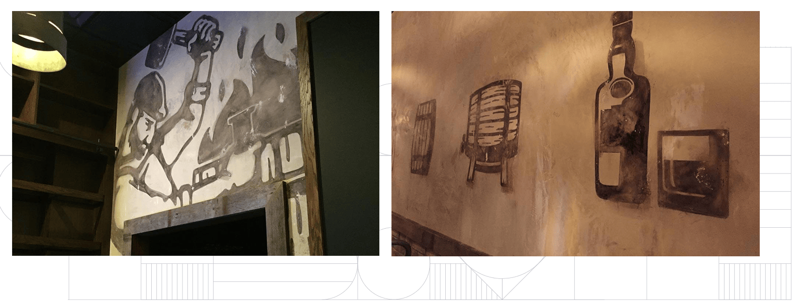
Much of The Oak Stave’s visual identity stems from the repeated use of icons that tell the story of the distilling process. These icons demonstrate just how much hard work goes into every single drink that The Stave’s patrons enjoy.
![]()
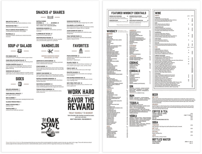

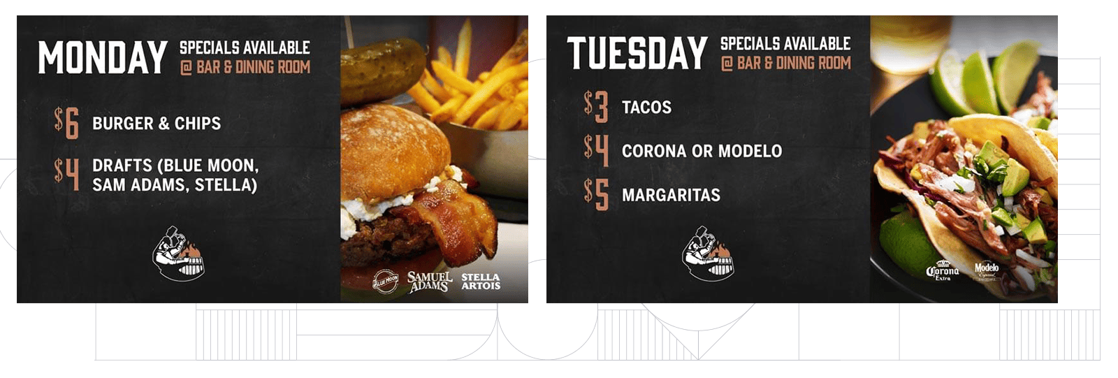
For a restaurant, the menu is one of the most crucial brand vehicles. The Oak Stave needed a menu that was in line with brand standards and still easy to read. A simple ingredient-listing style, instead of flowery descriptions, was the best realization of The Oak Stave’s brand: keep things simple and let the work speak for itself.


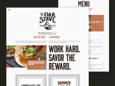
The Oak Stave needed a website that truly told its tale, and gave visitors all the usual information. Our team developed a voice that matched the visual identity and created a cohesive website that encouraged visitors to dig deeper into the Oak Stave story. The voice and the visuals were combined to create an engaging social media presence, generating opening-day and special event buzz that brings consistent traffic to the restaurant.
Much like The Oak Stave’s brand says, the hard work that both our team and the restaurant owners put into brand development paid off. The Oak Stave opened to an audience ready to embrace a restaurant that builds its success right alongside the hardworking community it serves.
Browse the amazing projects that we've done with The Oak Stave over the years. Cheers!
If brand strategy with meaning and thoughtful creative that connects with your customers is what you need from your creative marketing, give us a call at (716) 332-1640 x2 or send an email using the form below!