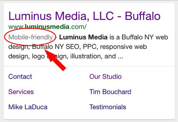
Recently we posted a link on Twitter and Facebook to the Google press release regarding their rollout of the new “Mobile-Friendy” tag in their search results. This not only improves the user experience on Google directing them to the most mobile friendly websites available in the search, but also benefits those that have taken steps to redevelop their current or new websites to respond to a variety of device sizes to benefit their visitors’ experience.
There are a lot of websites designed & built between 2010-2012 that while not appearing out dated in terms of looks are out dated in terms of structure. Namely, being able to respond to the visitors devices screen size and collapse vertically as needed. Even sites in our portfolio from that time period follow into this category.
This affects both user experience as well as ranking consideration on Google’s part.
It’s important to remember that entities like Google that handle the responsibility of guiding their visitors to the most relevant content also protect or inform those visitors to provide as much information about the destination site as possible before they waste their time. Google is in the business of working for the visitor, not the destination. It’s up to the website owner to take initiative to keep up with these trends and also cater to the visitor to make sure they have the best possible interaction with their website.
Google’s Mobile-Friendly Tag Test Tool
You can check to see how your site stacks up using Google’s Mobile Friendly tool here: https://www.google.com/webmasters/tools/mobile-friendly/
We’ll help get your Mobile-Friendly!
Whether you need a new website entirely or your current design needs a rebuild to restructure itself in a responsive format, you need to get a hold of us and we’ll get you back on the right track. Don’t miss out on visitors because you’re behind the times!
You can read more about Google’s update here: http://googlewebmastercentral.blogspot.com/2014/11/helping-users-find-mobile-friendly-pages.html