CBC Solutions Brand Identity
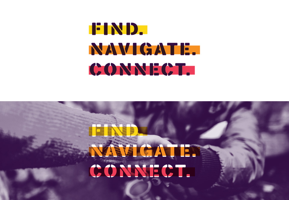
Navigating complex care.
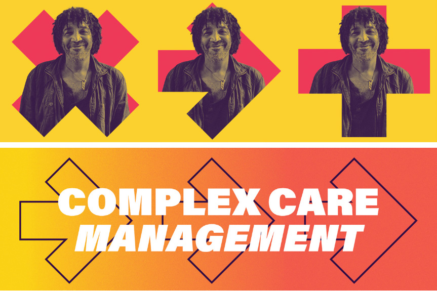
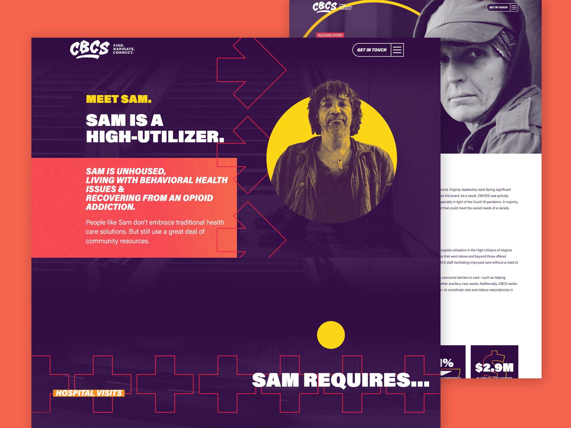
The CBC Solutions rebrand is a wild departure from the medically oriented green design of the past that featured a heart and pulse. CBCS is more personal than that. Making deep connections in the community to help navigate the most vulnerable and needy to the care they require.
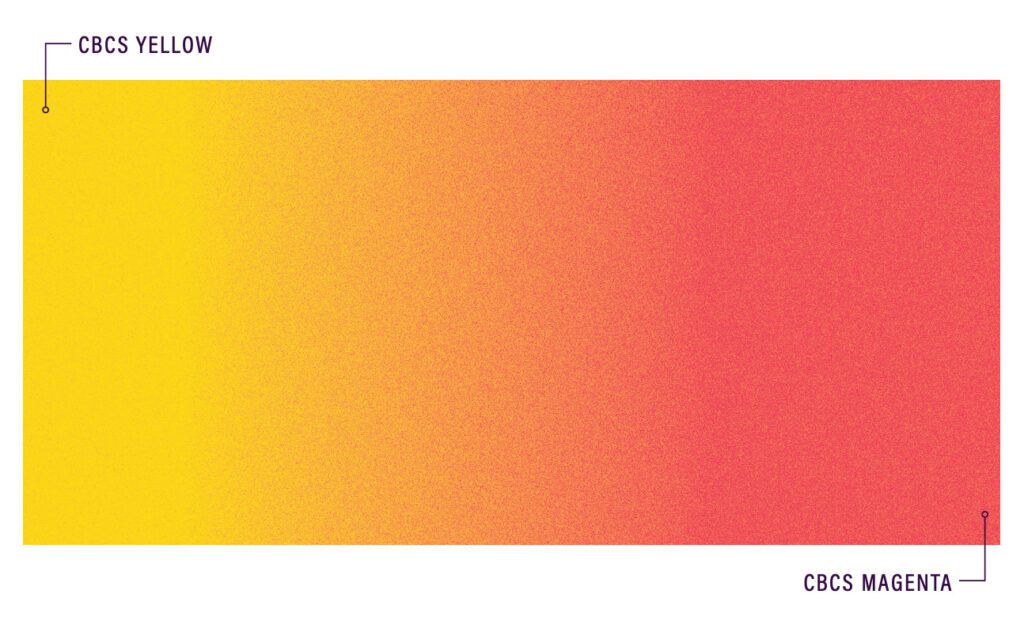
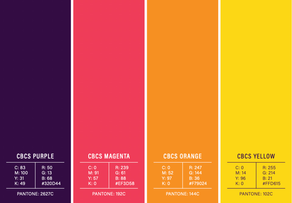
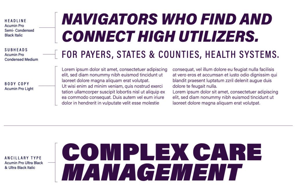
The new CBC Solutions brand identity takes a gritty, but professional approach to visualize their influence in urban environments. The grassroots navigation techniques their teams use to connect to individuals in the community, reflected in the almost “punk” look and feel of the high-contrast brand colors.