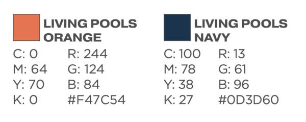

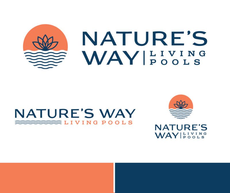

Branding a new company is a challenge in itself, but branding a company that has a product barely anybody has heard of is another challenge all together. Next, mix in the fact that it’s related to another company and you have a lot of things to overcome. With the Nature’s Way Living Pools identity, the colors were chosen to be soft and serene to reflect the feeling of what the end product provides. The lotus flower in the icon with subtle waves underneath gives a quick reference to the plant life included in a living pool design that makes it unique.
