Pick’d Logo
A fresh design.
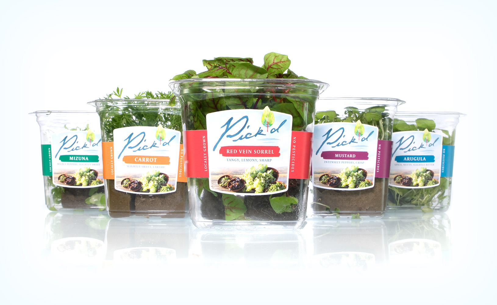
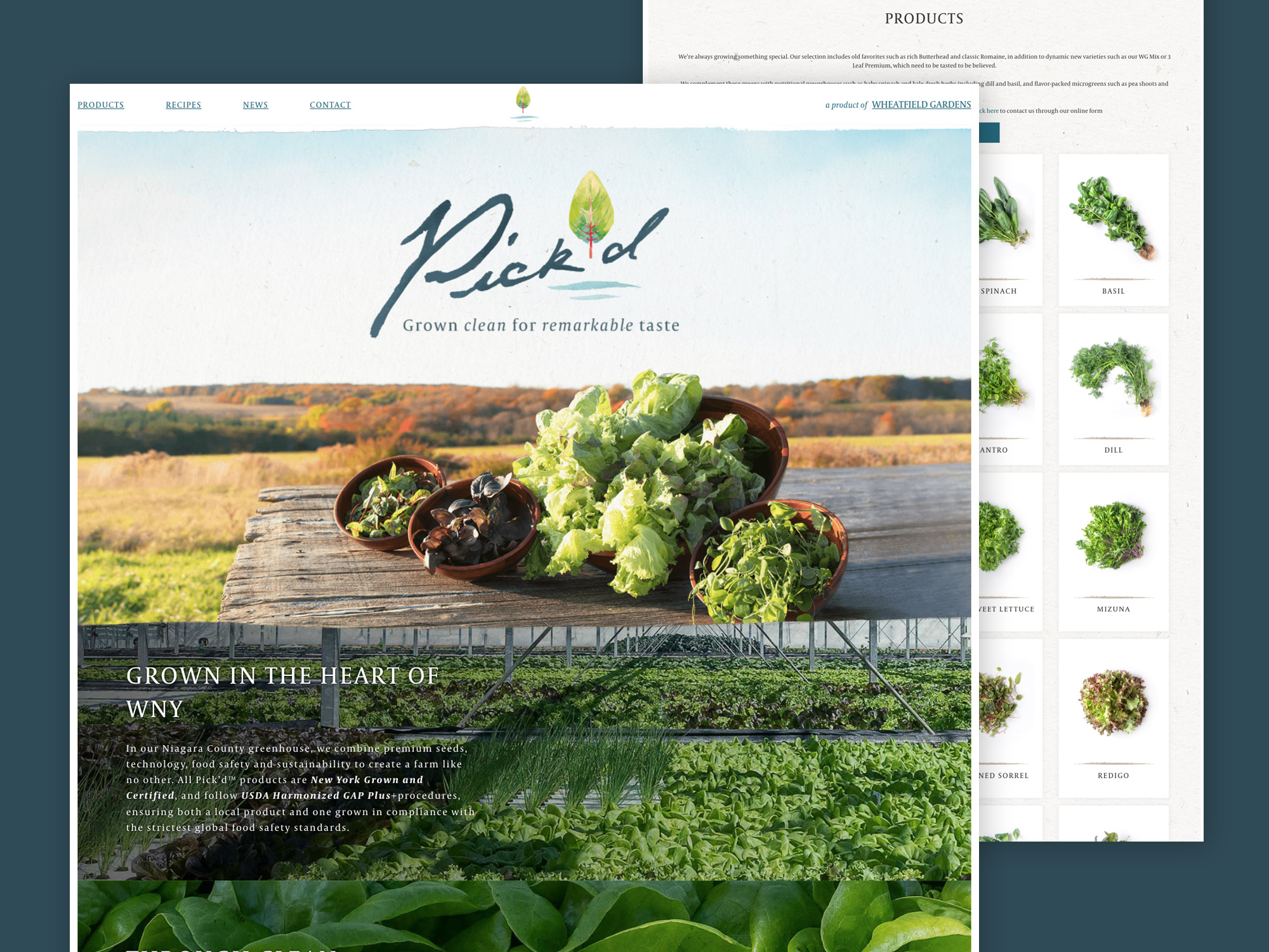
After naming the Pick’d brand in 2016, the logo design required a soft and artisan feel. The hand drawn lettering and watercolor icon pull this off. Paired with a pastel palette, the logo looks clean and fresh on airy colors that can easily be locked up with photography that has earth tones or is stark white. The logo is used on retail grocery packaging and wholesale sales materials.

I would like to take this time and this forum to thank the team at Luminus for the steady hand we needed and more importantly, for the steady hand we didn't know we needed. We came to Luminus with what we thought was a basic need, and thankfully, Tim,John and team, patiently guided us through a process that brought our basic need into a living strategy. The Luminus team has been able to translate our passions and our strengths into a message and belief for our community.
- Dennis Burns, Pick'd (Google Review)