Eaton Brothers Brand Identity
A new vision for new owners.
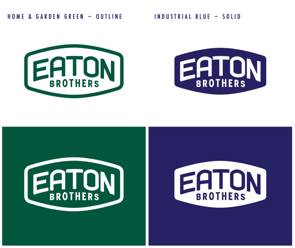
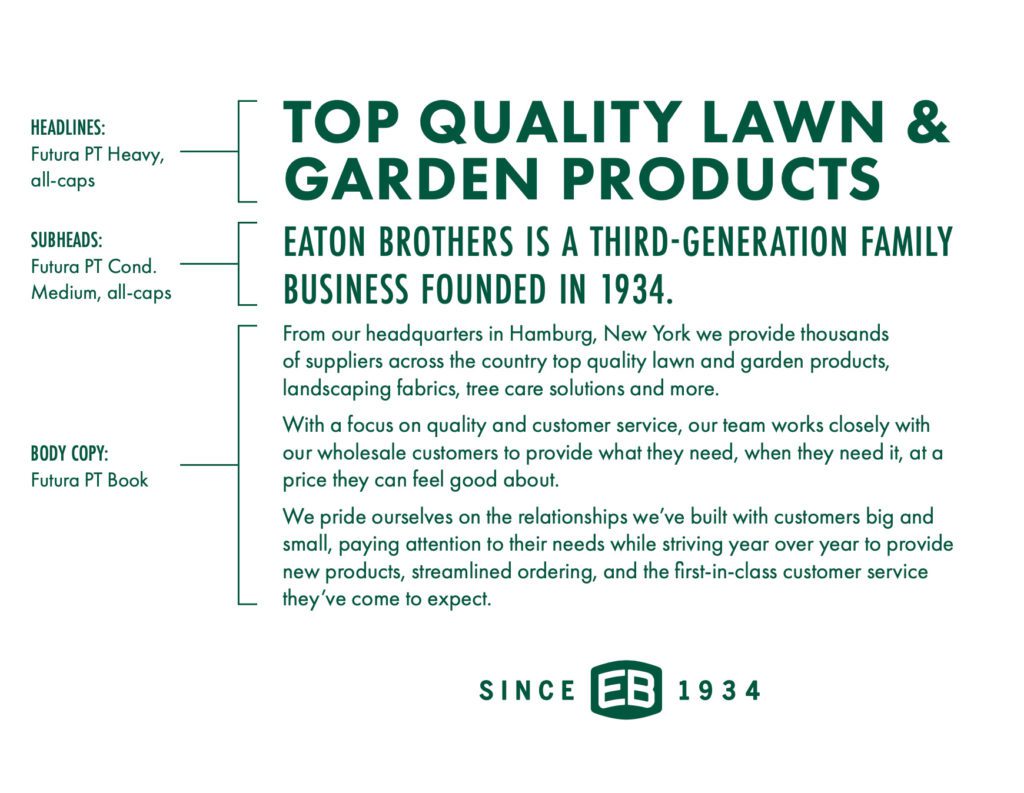
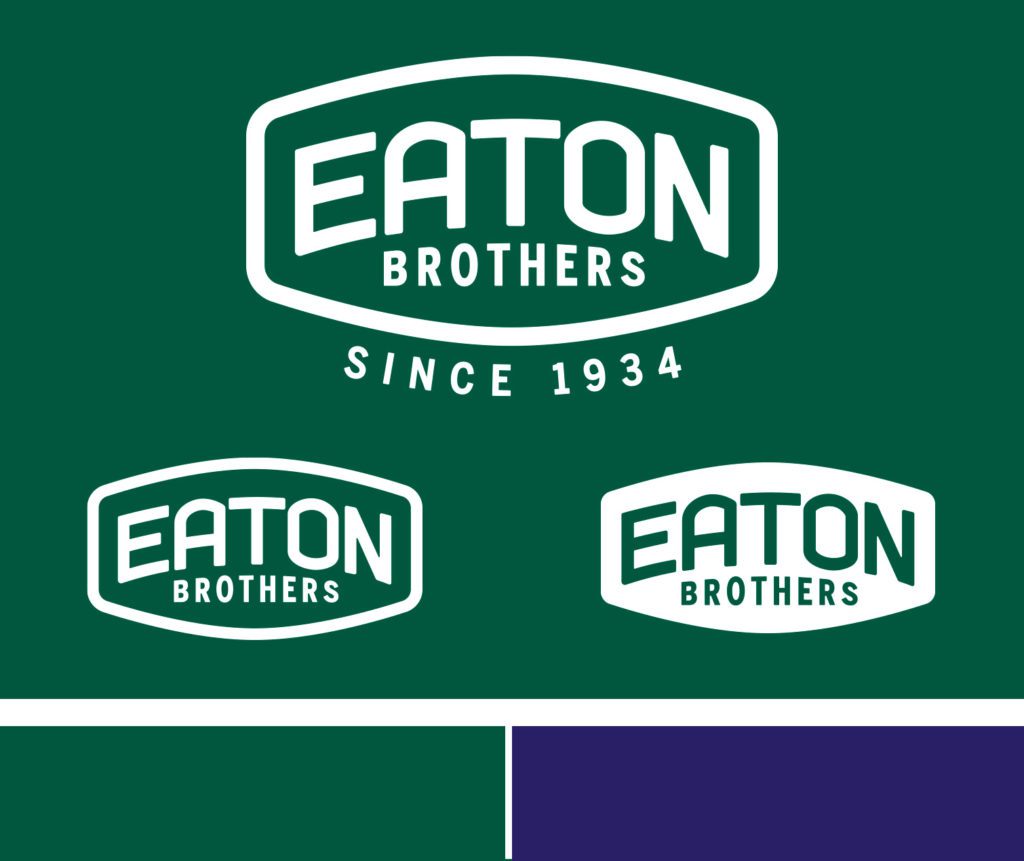
After new ownership took over at Eaton Brothers, they new they had to bring the nearly century old company into the modern era. Eaton Brothers had developed a good amount of industry recognition and also expanded its offerings beyond tree care products. The task, modernize the logo and make it inclusive to all of their offerings. The colors are split between the primary Eaton Brothers green, carried over from the previous tree care brand and contrasted alongside a navy blue that would represent its industrial product divisions. The fonts, bold and minimal. All of this would become critical to aligning their product packaging for consistency on the shelves.

Luminus is a great company to work with, friendly and passionate about taking your business to the next level.
- Alex Keogan