Druthers Beer Can Design
Standing out on the shelf.
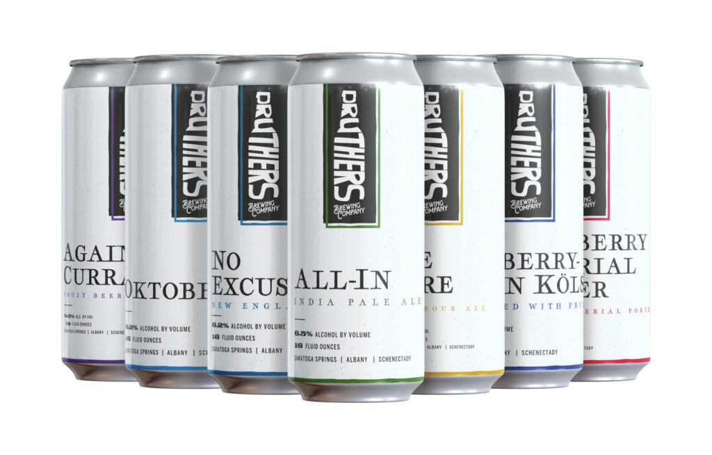
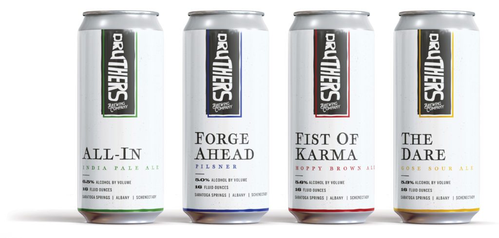
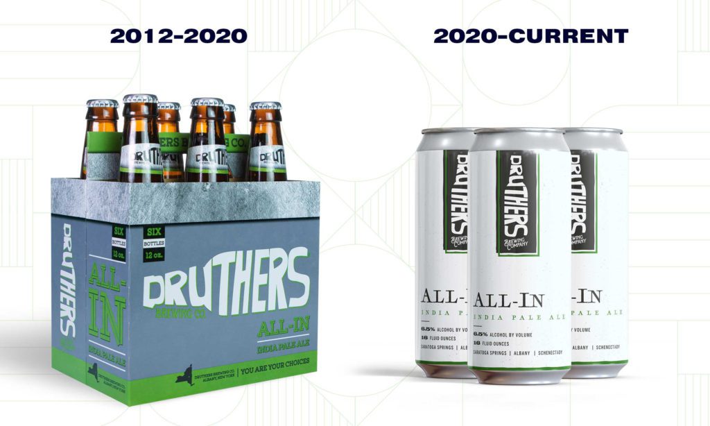
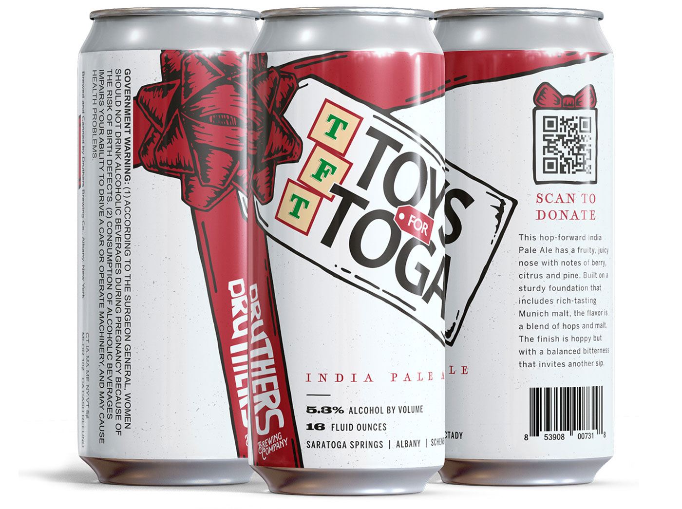
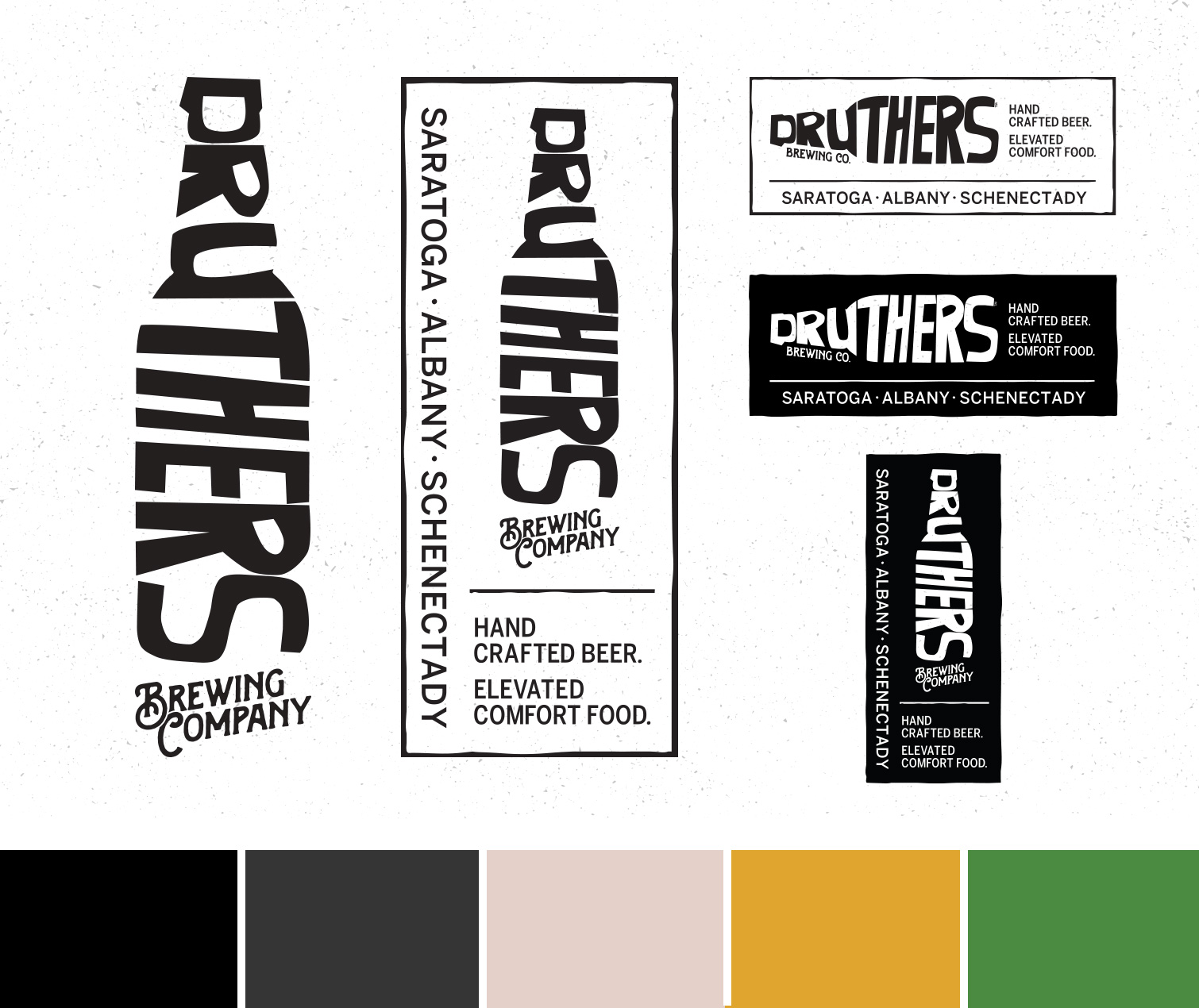
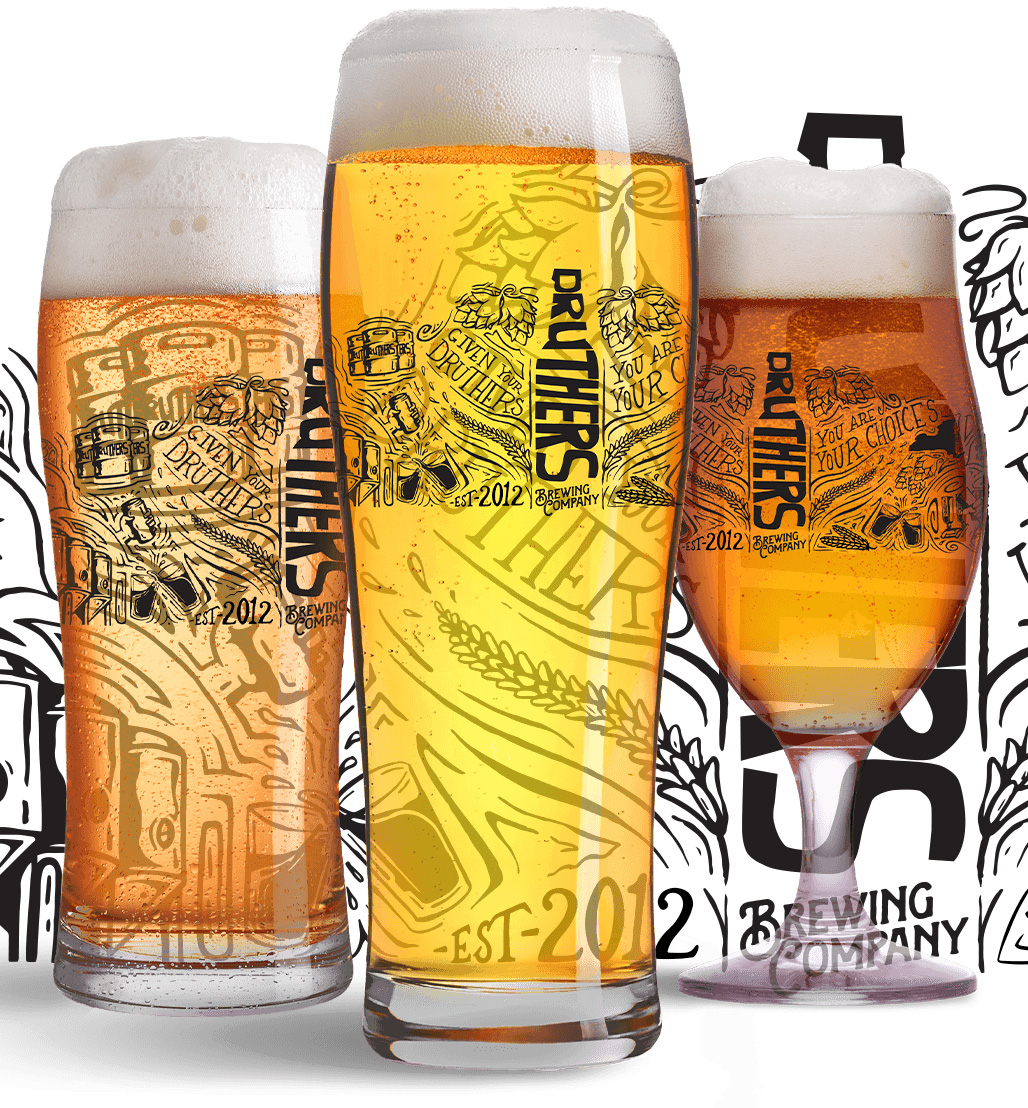
The need for a new Druthers beer label design coincided perfectly with the rebrand of the brewery. There was a need to switch from bottles to cans and with that a new label design was on the table and we jumped at the chance. The old bottles had a design layout that had text crossing patterns and dark logos on dark design elements. The new can labels would achieve two goals. First, a desired minimalist design that could be easily modified and produced quickly as new beers were released. Second, stand out on the shelves. Beer labels are amazing design pieces, but in a sea of color there’s only one way to stand out and the Druthers white with subtle color accents nailed it.