Please ensure Javascript is enabled for purposes of website accessibility
Menu
The Oak Stave Restaurant Brand Identity Design | Restaurant Branding
← Back to the Work

Identity Design

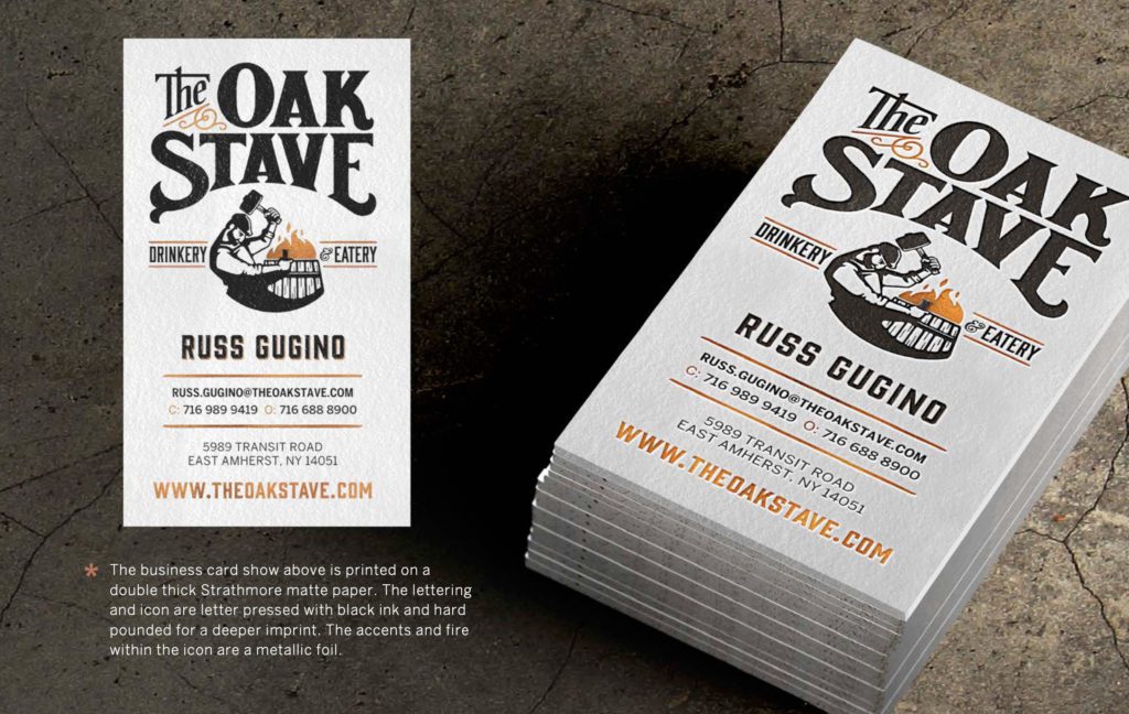
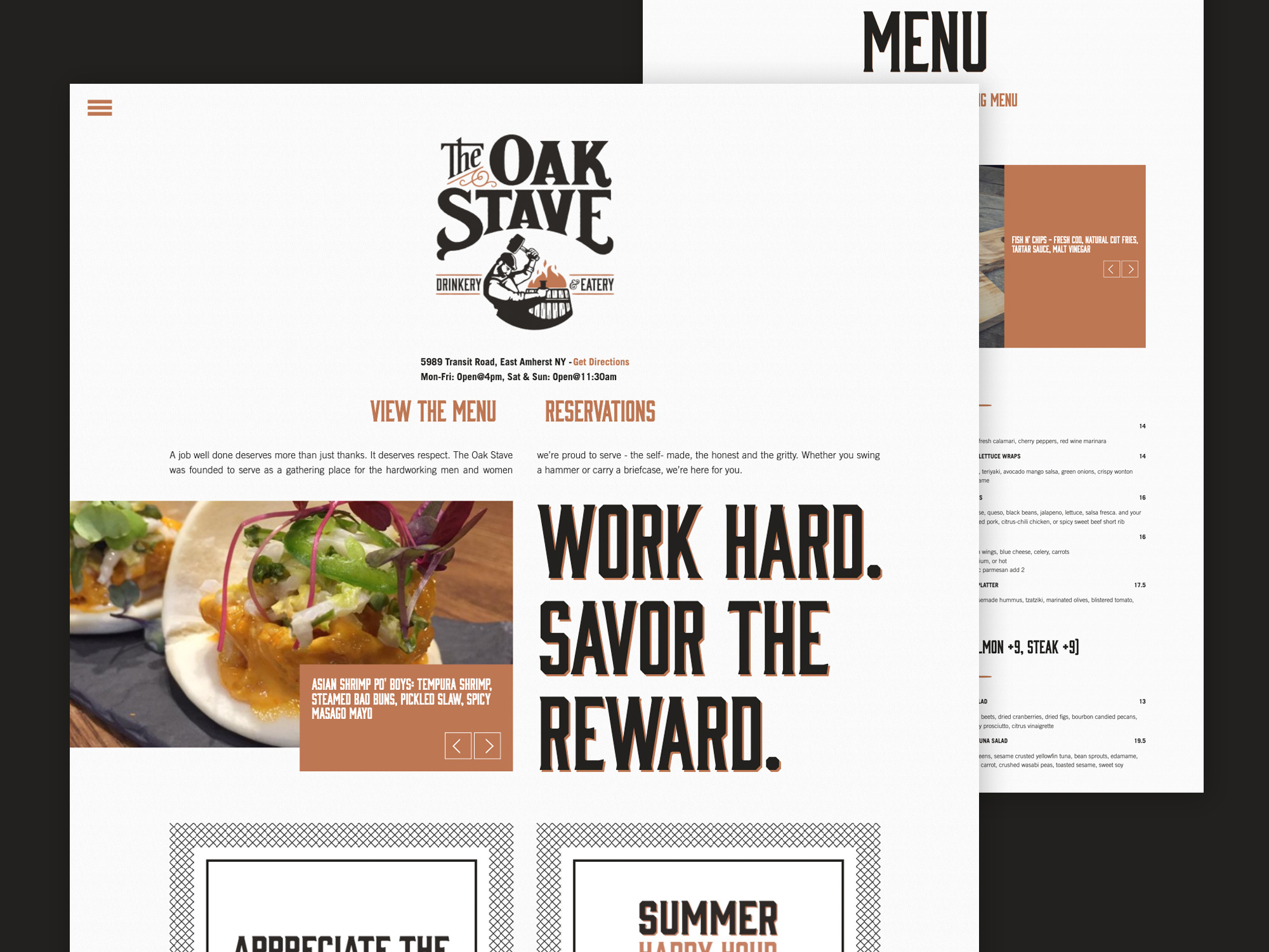
The Oak Stave Brand Identity

The Oak Stave Restaurant Brand Identity Design | Restaurant Branding Drop-Shadow Pattern

2016 Silver Addy Winner

Brand as a story.

The visual identity for The Oak Stave restaurant is more than just a logo and colors. The log itself brings together two main elements of the brand that are key to understanding its beliefs. The Cooper, a hard worker. The Stave, an unsung hero. The earthy colors, book art fonts, and iconic illustrations all tell the story of hard work and humbly earned rewards. The hand drawn logo font brings an old time feel to the logo lockup and frames the icons perfectly.

The Oak Stave Restaurant Brand Identity Colors | Restaurant Branding
The Oak Stave Restaurant Brand Identity Typography | Restaurant Branding
The Oak Stave Restaurant Brand Identity Photography | Restaurant Branding
The Oak Stave Restaurant Brand Identity Icons | Restaurant Branding
The Oak Stave Restaurant Brand Identity Typography | Restaurant Branding
The Oak Stave Restaurant Brand Identity Lockup Design | Restaurant Branding
The Oak Stave Restaurant Brand Identity Mantras | Restaurant Branding
The Oak Stave Restaurant Brand Identity Menu Design | Restaurant Branding
The Oak Stave Restaurant Brand Collateral Design | Restaurant Branding
The Oak Stave Restaurant Brand Business Card Design | Restaurant Branding

Related Work