Responsive [re·spon·sive] adjective: Reacting in a desired or positive way / quick to react or respond.
When we hear “responsive” we think web, right? It’s 2014 after all, responsive now means that a website will adapt to all devices and browser sizes.
As designers, we love this concept. It allows us to create one design which will be pushed to multiple mediums and will fluidly adjust and therefore have more staying power than traditional web design.
Do we ever think of this for other facets of our broad, and often ambiguous, industry? I sure don’t. However, a site was launched recently to show the ability of logos (branding) to respond based on application.
GO HERE >>> http://www.responsivelogos.co.uk/
Same as you would test a website, grab the edge of your browser window and scale it in horizontally. You will notice the logos become more and more simplified. This ultimately shows the strength of the brand, the quality of the logo, and the forethought of the designer. Every single logo design meeting I have ever had, the client has said the exact same thing:
“I want my logo to be simple, like Nike – where you see the swoosh and you know it’s Nike.”
I (and every other designer in the world) would then reply, “Well, you recognize that because the brand is super established, getting a new icon to be universally recognized for your company is not that simple.” This usually then begins the discussion of using the company name or some imagery of what the business does as logo elements. Even though your logo is not necessarily ever going to be as famous as the Nike swoosh, it does not mean that it can’t be recognized by the symbol itself as a separate entity from your logo.
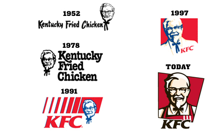
As you can see in the KFC logo timeline below, as the brand has grown, the logo has simplified. It started out clearly stating the company’s product: “Kentucky Fried Chicken” – then adapted the acronym, and now relies on the simple image of Colonel Sanders with the acronym consuming less real estate.
** They are able to do this because they have been strengthening their brand since 1952. KFC is now a household name.

Interesting side note:
Popular belief would lend you to believe that the name “Kentucky Fried Chicken” was dropped in favor of “KFC” because (of the rumor) they do not serve actual chicken. This is 100% not true. Actually, the acronym was adapted in 1991 to remove the FRIED portion in an attempt to give the company a healthier image.
Logo study: http://logos.wikia.com/wiki/KFC
Fake Chicken study: http://wafflesatnoon.com/kfc-fake-chicken/
SUMMARY
– As designers, it’s always important for us to think about the future uses of anything we work on. This especially applies to branding. It is crucial that we consider smaller/unique applications of the logo from the very first concepts all the way to the final delivery.
– Ideally we will create a logo (initially) to somehow lend itself to the company image, product(s), or industry.
– We need to avoid getting too specific with this, potentially creating a need to drop the logo as a client’s business reach expands and grows. Remember, a brand is something that is built – abandoning a logo to start fresh can actually be a setback.
We need to always think “responsively,” “future proof,” “dynamic,” “insert buzzword here,” “etc”. (joke aside from the responsive part)

