This is What It’s Like to Win Gold at the American Advertising Awards

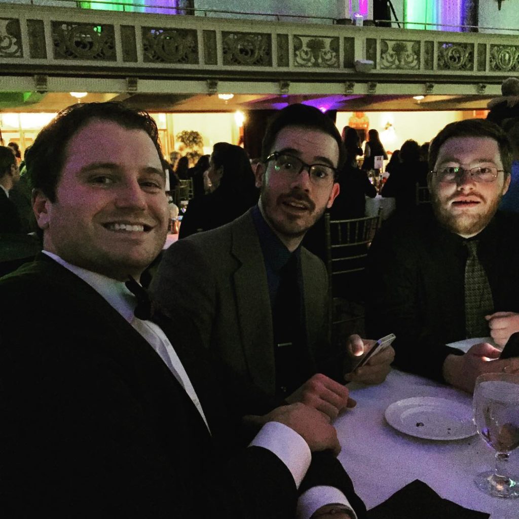
1. You and a handful of your best friends get dressed to the nines and show up at the Statler.
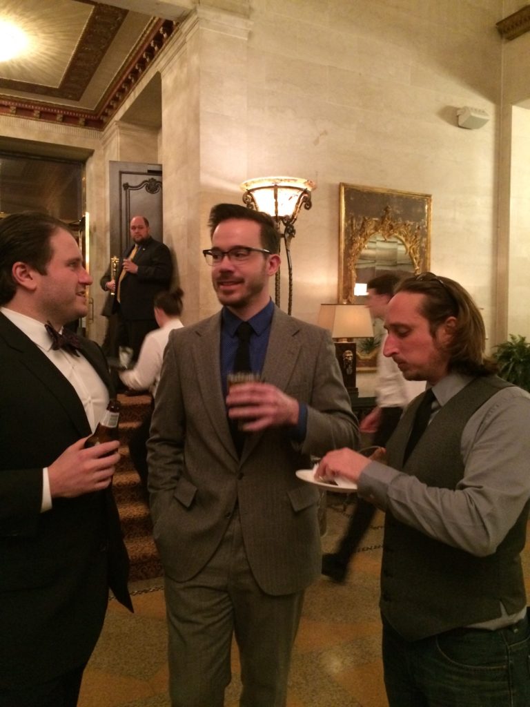
2. You admire the chandeliers; you admire the staggering assembly of talent; you admire the generous table of hors d’oeuvres; you admire how much effort FARM put into making the whole night seem like a wedding as you sashay up to the open bar.
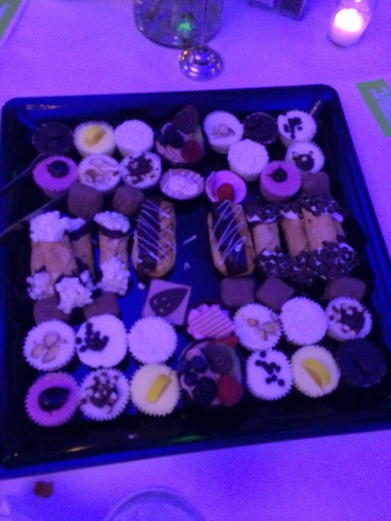
3. As you’re busy admiring the array of desserts in front of you, the ceremony begins, not with a bang but with a rimshot.
Backed by a wedding band, presenter Greg Bauch launches into a medley of popular songs rewritten for the advertising world (“YMCA” becomes “Strong CTA,” etc.).
4. The awards start rolling, well-deserved golds and silvers all around but none for you.
Worry leads you to pull on the sleeve of your boss only to find out that you didn’t enter any of these categories. Even if you did, you’d still be impressed by the competition, like:
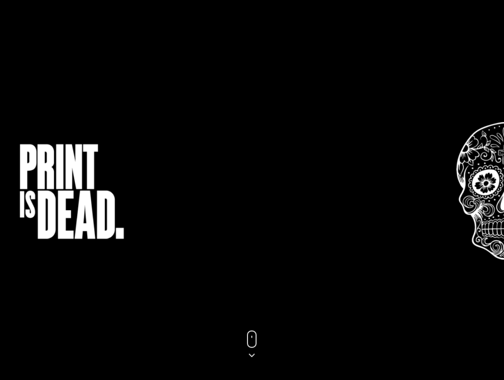
15 Fingers‘ Print is Dead Campaign:
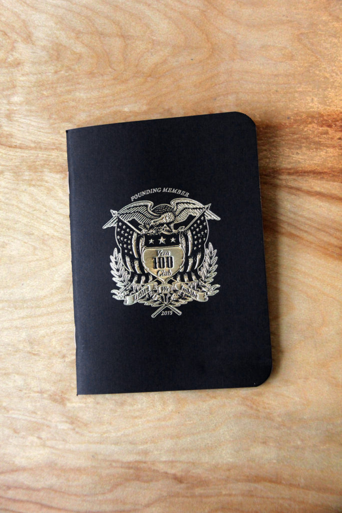
Block Club’s Vera Pizzeria Passport:
dPost‘s incredible post-production work in this WildAid ad featuring Tony Jaa:
5. You sip your drink anxiously.
6. And then – the moment of truth: they call your name.

You’re proud, partly because you won something, but mostly because you’re in such great company.
What We Won:
Gold: The Hop Shop Logo
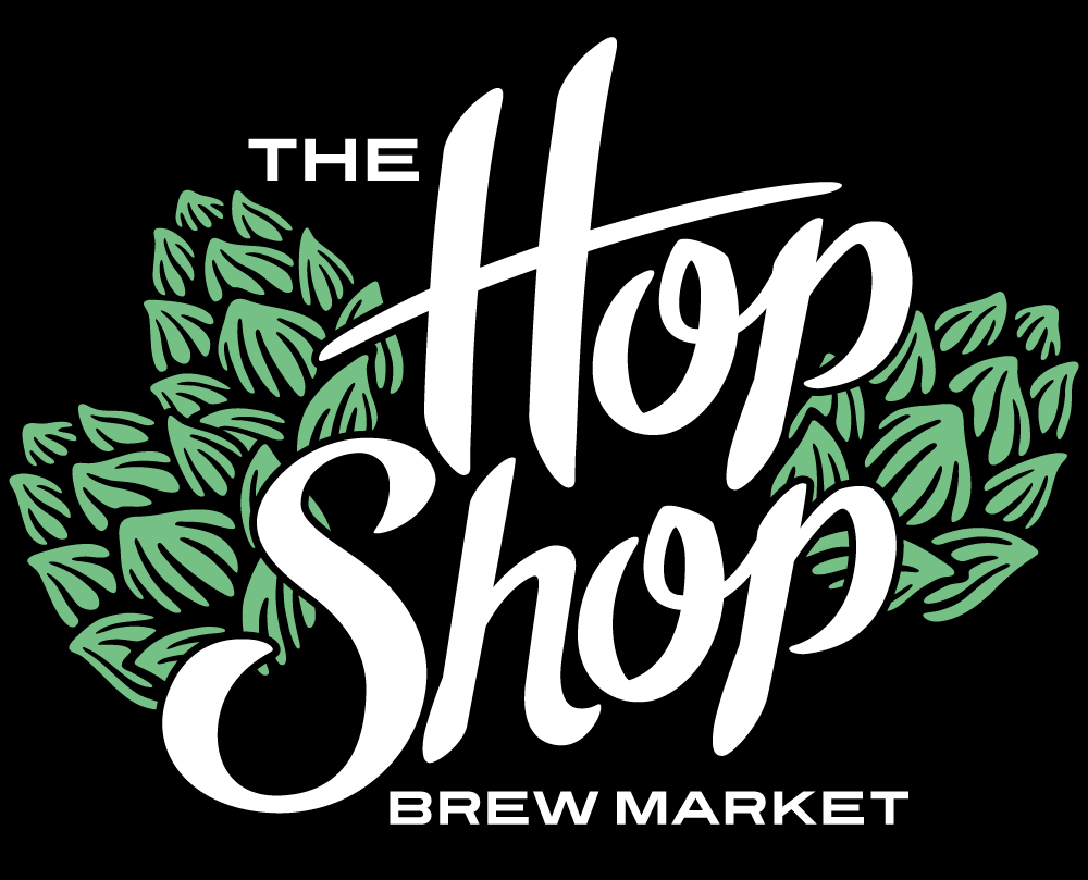
“I felt quite proud when it won.” – Designer John English, one of the humbler folks in the world. We heard tons and tons of great feedback on this logo, especially on his hand-drawn “S,” and we were proud of him as well.
Gold: Druthers Website
Case study pending, but suffice to say this one was a labor of love. We won for the whole website, but we’re particularly proud of the SVG animation on their Story page. Check the website out here to see the full animation for yourself.
Silver: Oak Stave Logo
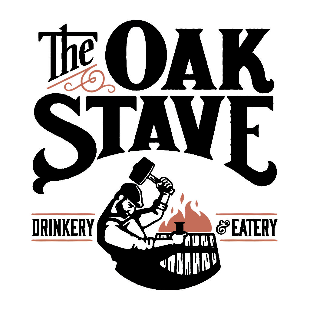
Expect to see a whole lot more of our friend The Cooper when this restaurant opens.
Silver: Druthers Posters
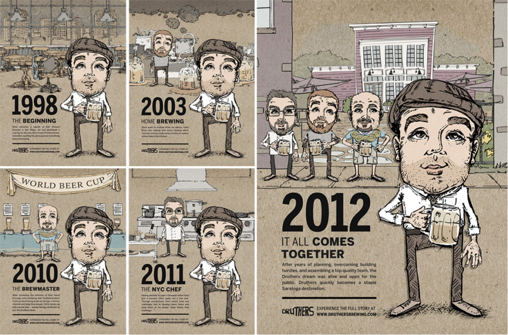
The website is great, but the judges agreed that Mike’s awesome contour-drawing inspired illustration shines in print as well.
Special Mention
Gold: The Chew (student submission)
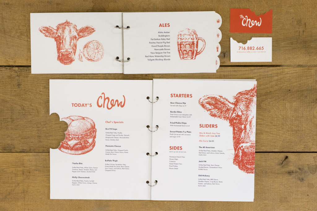
I think we all screamed the loudest when our student designer, Chelsea Turton, won gold for her integrated brand identity campaign, The Chew. We can’t take credit for it, but we’re very proud of her.
A note from partner Tim Bouchard:

Each year we revel the chance to share our works with all of our friends in the advertising community. It’s a great form of pride that swells when you throw yourself into such a pool of awesome talent and hope you come out the other side recognized. As our company has grown as well as our team, we’ve been fortunate enough to work with some amazing clients that really latch on to what our vision is and allow us to execute new and exciting things for them. Without that partnership with our clients and the wide spectrum of talent in the Buffalo area to push us to do better each time, we’d be unable to create such great work. We’re looking forward to next year already!