Vintage Bottle Caps: Weird Polar Bears, Orange Headed People & More

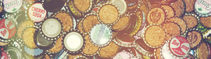
I’ll be honest; this is a nostalgia piece. And what evokes those bleary-eyed, time-sweetened, back-in-the-day memories of bygone eras better than soda pop? Or more specifically, if you’re a design nerd like myself, soda bottle caps.
Long before the plain plastic screw-off caps of today, bottle caps were more than just an afterthought. These slightly larger than one-inch diameter metal caps were as much a part of the brand and the experience as the label on the bottle and perhaps even the soda itself.
It’s this attention to detail that makes them so attractive to me as a brand designer. They created part of a fuller overall experience and the challenge of fitting an appropriate amount of visual information in an appealing way on such a small surface is very intriguing.
I’ve collected just a small handful of examples of these little beauties from a golden age of bottle cap design – the early to mid-twentieth century. I could go into detail about what makes a good design but this is more emotional than that. These caps are more about the feelings they evoke rather than any concrete principles.
Nesbitt’s Orange
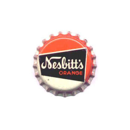
The Nesbitt Fruit Products Corporation, founded in 1924 in Los Angeles, first produced Nesbitt’s Orange as a soda fountain product in 1927 and it made its way to the bottle by the end of the 1930s. It remained popular for most of the twentieth century, gaining market-leader status in the late 1940s and 1950s through the help of advertisements featuring a then-unknown model named Marilyn Monroe.
This cap was probably used from the 1950s-60s. The rather peculiar N in Nesbitt’s first grabs your attention with the unusual loop at the bottom right of the stroke and finishes with a swash that draws you into the rest of the type. The rest of the script is very friendly and inviting and feels quintessential to the time period. The stout sans serif ORANGE is beautiful and pairs perfectly with the script above it. There’s great contrast in the orange, white and black color scheme and the funky black trapezoid creates movement and dynamism while still feeling perfectly balanced.
Eskimo Cream Soda
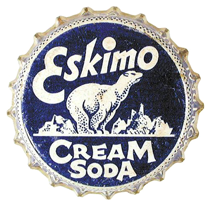
Eskimo Cream Soda was a brand of Eskimo Beverages. It was bottled by Eskimo Bottling Works in Montreal, Quebec in the 1940s though its origin date and length of production is unclear.
The unusual type is the first thing you notice about this cap with its irreverence towards type rules and disregard for any sort of baseline. The swooping E and the giant tittle on the i are particularly fun and effective. The type almost feels carbonated. But what I find most intriguing about this cap is the polar bear with his extra long neck, very narrow stance, and overall lumpy appearance. The small dots successfully convey form. The amount of detail achieved with just one color and at such a small size is impressive. I’ve seen other Eskimo Beverage caps that are largely the same except the background color changes to correspond to the flavor. Of those I’ve seen this dark blue feels the most appropriate.
Bat-Juice
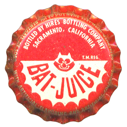
I’ve spent a good deal of time scrubbing the Internet and still have no idea what Bat-Juice is. It most likely came out as part of a rash of bat-themed products that flooded the market due to the popularity of the campy Adam West Batman TV series that aired from 1966-1968. I can tell you that it was bottled by Hires Bottling Company of Sacramento, CA.
What is most appealing about this cap is its absurdity. The weird Batman logo rip-off with his goofy smiling face has an odd charm. The shape of the bat fits satisfyingly into the bottom portion of the cap, splitting it in half and almost creating a yin-yang sense of balance. BAT-JUICE has a weird angularity to it that seems to reference some Saul Bass movie posters – an aesthetic I’ve always enjoyed.
UPDATE: one of our readers, Joe Blenkle, wrote in with a bit more info on Bat-Juice:
“I remember Bat-Juice as a kid…probably mid-to-late 60s….it was a carbonated fruit punch soda type drink. I loved the stuff. I don’t know why I started thinking of it tonight, but I went searching for it on the Internet and found your article…and little else. Maybe it was just a product local to the Sacramento, CA area. We would buy it in the Safeway in North Highlands (just outside Sacramento). I’m wishing it was still around. It was really good.”
Chirp
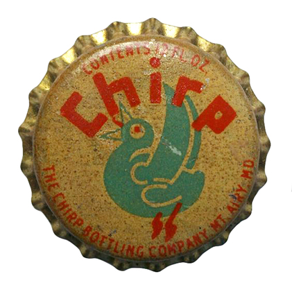
This version of Chirp was bottled by the Chirp Bottling Company of Mount Airy, MD from 1938-1942. However, during the same period there was The Chirp Company of Alexandria, VA creating a soda that used the same logo and slogan, “A bird of a drink”. While I imagine being a bird of a drink is positive, it gives no indication as to the flavor.
The colors are probably the most striking part of this cap. The orange and turquoise on white would have been hard to miss before time got to it and yellowed it out. The strange, bulgy bird looks a lot more like it’s squawking than chirping with its wide-eyed, tongue out expression but it’s quite entertaining. The blocky type has some weird spacing and inconsistent widths that leave it feeling almost juvenile.
Heart O’ Orange
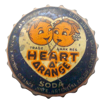
Heart O’ Orange was bottled under supervision of Harrison’s Orange Products Inc. of Chicago, IL. Its years of production are unclear but it was labeled as an orange “drink” and was likely not carbonated like a standard soda.
The first thing you notice about this cap is inevitably the orange-headed people. From what I’ve seen they’ve gone through a number of different illustration styles over their lifespan but this incarnation seems to be the most graphic and easiest to reproduce on a bottle cap. Their leafy hair is reminiscent of Little Green Sprout, Green Giant’s animated spokes-kid. Although this couple definitely predates him so perhaps it is the other way around. The orange and blue create a high-contrast color scheme and the plump, almost bulging type is quite nice. The triangular O’s are unexpected considering the overall roundness of every other part of the design but I quite like them.
Blue Bird Imitation Grape Soda
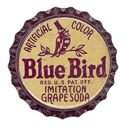
From what I can tell Blue Bird Imitation Grape Soda began being bottled as early as 1929 by the Quality Beverage Company of Johnson City, TN, under license from the Citrus Products Company of Chicago, IL. Its production continued through the 1930s and perhaps longer.
The most noticeable part of this cap is the bold Blue Bird type. The thick weight and soft serifs make it feel both confident and friendly. The bird is an example of a less successful small-scale illustration. The details of his face become a bit muddled but he sure looks shiny and quite distinguished in his stovepipe hat. I also find the honesty of “imitation grape soda” to be quite endearing.
Fire-Water
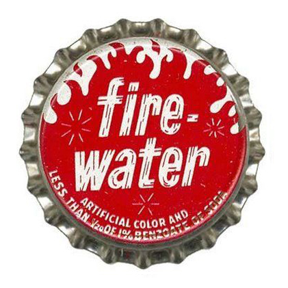
After a good deal of digging around the internet I was able to find little to no information about Fire-Water other than it contains less than 1/20 of 1% of benzoate of soda which when combined with ascorbic acid may form benzene, a known carcinogen. But this seems to be well below the level considered dangerous for consumption so you can drink confidently.
The red and white color scheme creates a really standout contrast on this cap. It’s simple and effective and the large area of rich red is quite appealing. The forward lean and interior lines (which also make it look like fire wood) lend an appropriate sense of urgency while the lowercase letters keep it from feeling too much like shouting. I can almost feel the bubbles going up my nose just looking at it.
If you’re interested in checking out more vintage bottle caps, a simple search on Pinterest will return hours of entertainment.